P.P.O.W
Client
PPOW Gallery
Studio
exhibit-E Collage
Involvement
Web Design · Frontend · HTML · CSS · JS
The challenge was to translate P.P.O.W’s strong identity to the web without competing with the artwork. Bold typography carries the identity, while the surrounding interface remains minimal.
Flexible page layouts give the gallery freedom to present varied content while maintaining consistency across the site.
P.P.O.W
Client
PPOW Gallery
Studio
exhibit-E Collage
Involvement
Web Design · Frontend · HTML · CSS · JS
The challenge was to translate P.P.O.W’s strong identity to the web without competing with the artwork. Bold typography carries the identity, while the surrounding interface remains minimal.
Flexible page layouts give the gallery freedom to present varied content while maintaining consistency across the site.


Client
PPOW Gallery
Studio
exhibit-E Collage
Involvement
Web Design · Frontend · HTML · CSS · JS
The challenge was to translate P.P.O.W’s strong identity to the web without competing with the artwork. Bold typography carries the identity, while the surrounding interface remains minimal.
Flexible page layouts give the gallery freedom to present varied content while maintaining consistency across the site.
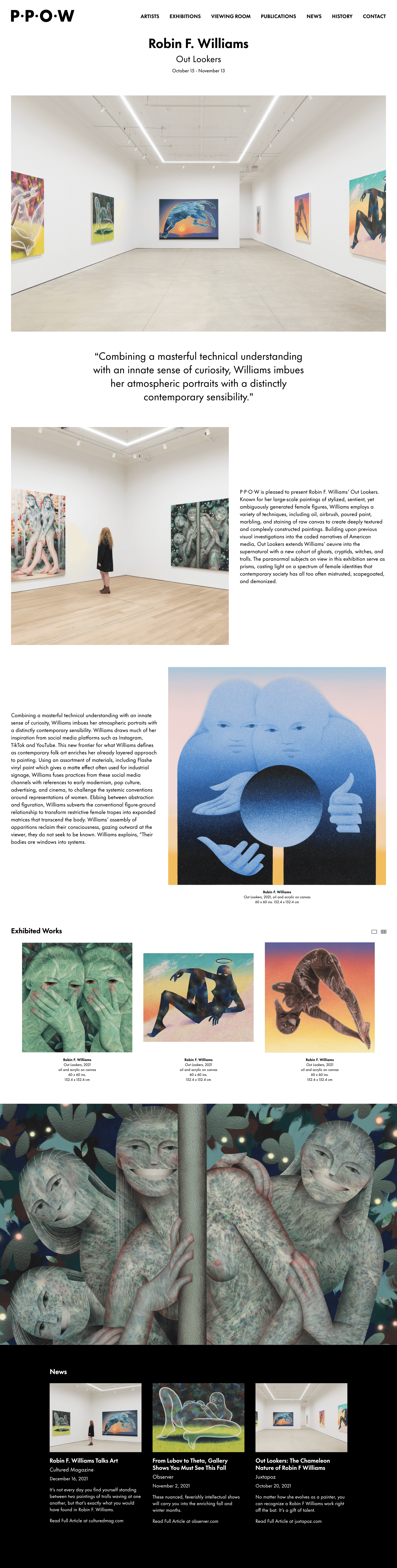
Detail Page
Modular editorial layouts support varied content, while inverted sections distinguish related material.
Detail Page
Modular editorial layouts support varied content, while inverted sections distinguish related material.
Detail Page
Modular editorial layouts support varied content, while inverted sections distinguish related material.
Detail Page
Modular editorial layouts support varied content, while inverted sections distinguish related material.
Detail Page
Modular editorial layouts support varied content, while inverted sections distinguish related material.

Menu
The exhibitions index organizes multiple locations using the logo’s bullet motif as a visual marker.

Type
Oversized typography extends the gallery’s identity to the artist index while keeping navigation direct.
Menu
The exhibitions index organizes multiple locations using the logo’s bullet motif as a visual marker.
Type
Oversized typography extends the gallery’s identity to the artist index while keeping navigation direct.
Menu
The exhibitions index organizes multiple locations using the logo’s bullet motif as a visual marker.
Type
Oversized typography extends the gallery’s identity to the artist index while keeping navigation direct.
Menu
The exhibitions index organizes multiple locations using the logo’s bullet motif as a visual marker.
Type
Oversized typography extends the gallery’s identity to the artist index while keeping navigation direct.
Menu
The exhibitions index organizes multiple locations using the logo’s bullet motif as a visual marker.
Type
Oversized typography extends the gallery’s identity to the artist index while keeping navigation direct.
Scroll
I extended Collage with custom CSS and JS to add a sticky menu, parallax, and slide-in transitions.
Scroll
I extended Collage with custom CSS and JS to add a sticky menu, parallax, and slide-in transitions.
Scroll
I extended Collage with custom CSS and JS to add a sticky menu, parallax, and slide-in transitions.
Scroll
I extended Collage with custom CSS and JS to add a sticky menu, parallax, and slide-in transitions.
Scroll
I extended Collage with custom CSS and JS to add a sticky menu, parallax, and slide-in transitions.
Parallax
Parallax adds subtle depth without distracting from the artwork.
Parallax
Parallax adds subtle depth without distracting from the artwork.
Parallax
Parallax adds subtle depth without distracting from the artwork.
Parallax
Parallax adds subtle depth without distracting from the artwork.
Parallax
Parallax adds subtle depth without distracting from the artwork.

Desktop
Layouts use the larger desktop canvas while maintaining consistent proportions and spacing.

Mobile
Complex grids simplify to one or two columns on mobile, preserving hierarchy on smaller screens.
Desktop
Layouts use the larger desktop canvas while maintaining consistent proportions and spacing.
Mobile
Complex grids simplify to one or two columns on mobile, preserving hierarchy on smaller screens.
Desktop
Layouts use the larger desktop canvas while maintaining consistent proportions and spacing.
Mobile
Complex grids simplify to one or two columns on mobile, preserving hierarchy on smaller screens.
Desktop
Layouts use the larger desktop canvas while maintaining consistent proportions and spacing.
Mobile
Complex grids simplify to one or two columns on mobile, preserving hierarchy on smaller screens.
Desktop
Layouts use the larger desktop canvas while maintaining consistent proportions and spacing.
Mobile
Complex grids simplify to one or two columns on mobile, preserving hierarchy on smaller screens.

Homepage
A modular grid lets the gallery combine single, stacked, and multi-column entries as content changes.
Homepage
A modular grid lets the gallery combine single, stacked, and multi-column entries as content changes.
Homepage
A modular grid lets the gallery combine single, stacked, and multi-column entries as content changes.
Homepage
A modular grid lets the gallery combine single, stacked, and multi-column entries as content changes.
Homepage
A modular grid lets the gallery combine single, stacked, and multi-column entries as content changes.
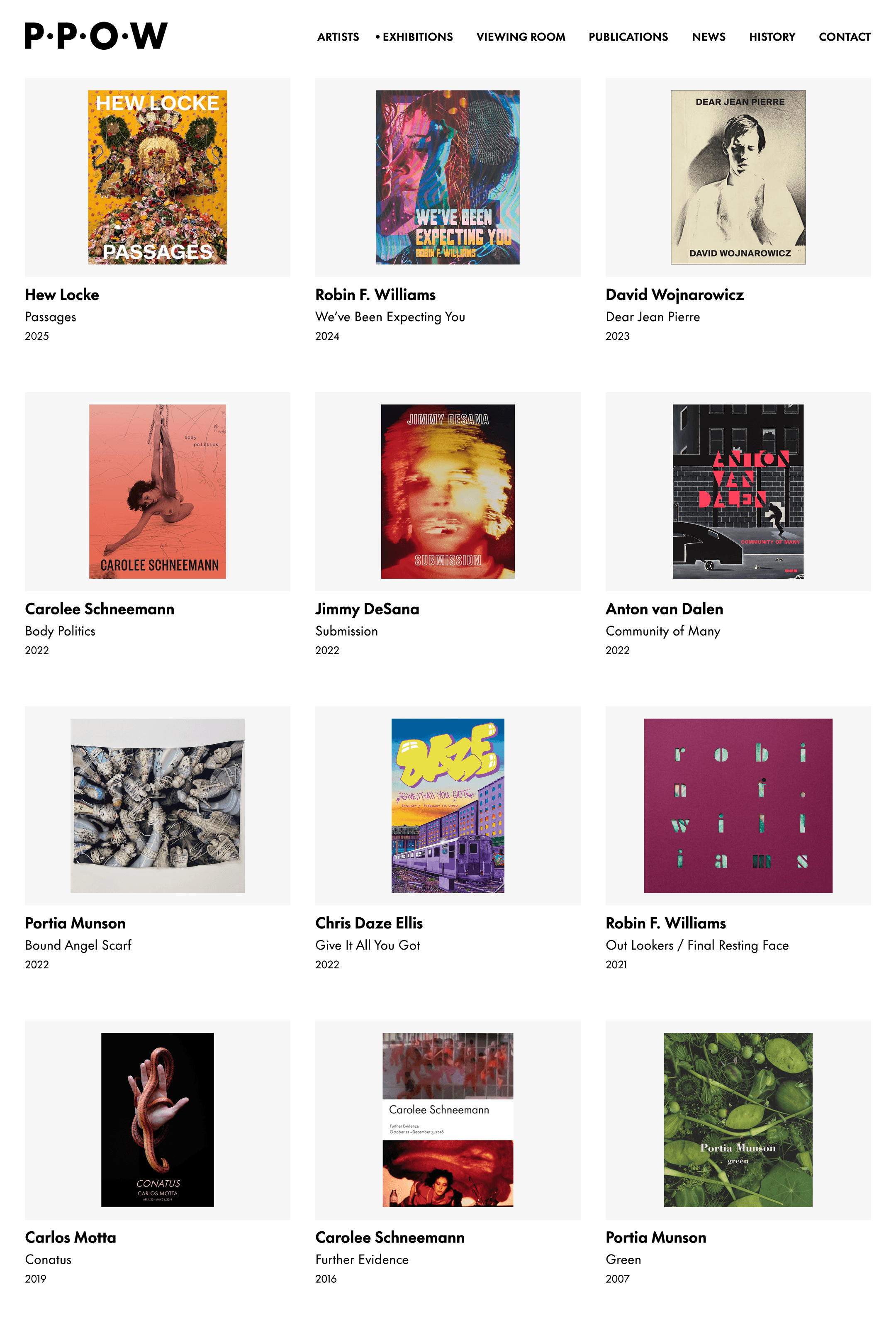
Index Page
The Publication Index continues the typographic theme.

Detail Page
An asymmetric two-column layout separates publication details while maintaining the site’s typographic structure.
Index Page
The Publication Index continues the typographic theme.
Detail Page
An asymmetric two-column layout separates publication details while maintaining the site’s typographic structure.
Index Page
The Publication Index continues the typographic theme.
Detail Page
An asymmetric two-column layout separates publication details while maintaining the site’s typographic structure.
Index Page
The Publication Index continues the typographic theme.
Detail Page
An asymmetric two-column layout separates publication details while maintaining the site’s typographic structure.
Index Page
The Publication Index continues the typographic theme.
Detail Page
An asymmetric two-column layout separates publication details while maintaining the site’s typographic structure.
Selected Work
SelectED Work

P.P.O.W
P.P.O.W

Kenzo Estate
Kenzo Estate
Kenzo Estate

Rethinking Design
Rethinking Design
Rethinking Design

Independent
Independent
Independent

Meadowood Napa Valley
Meadowood Napa Valley
Meadowood Napa Valley

Collage
Collage
Collage

The Armory Show
The Armory Show
The Armory Show

Eva Presenhuber
Eva Presenhuber
Eva Presenhuber

AIPAD
AIPAD
AIPAD

The Willem de Kooning Foundation
The Willem de Kooning Foundation
The Willem de Kooning Foundation

The Gordon Parks Foundation
The Gordon Parks Foundation
The Gordon Parks Foundation

Ray Johnson Estate
Ray Johnson Estate
Ray Johnson Estate

LaChapelle Studio
LaChapelle Studio
LaChapelle Studio